How to earn from travel Branding
Project Brief
How to Earn from Travel approached us to create a distinctive brand identity that would capture the essence of profitable travel opportunities whilst maintaining a professional and aspirational aesthetic. The client required a logo that would resonate with digital nomads, travel entrepreneurs, and individuals seeking to monetise their wanderlust.
Initial Concept Development
Our design team began by exploring distinct conceptual directions. The first concept focused on traditional travel iconography including suitcases, passports, and currency symbols, but felt too literal and corporate. The second direction emphasised the earning aspect through graphical representations of money and growth charts, though this approach lacked the inspirational quality the brand required.
The third concept, which ultimately became our foundation, centred around the idea of journey and opportunity flowing together like natural forces. We began sketching wave-like forms that could represent both travel paths and the flow of income streams.
Concept Refinement
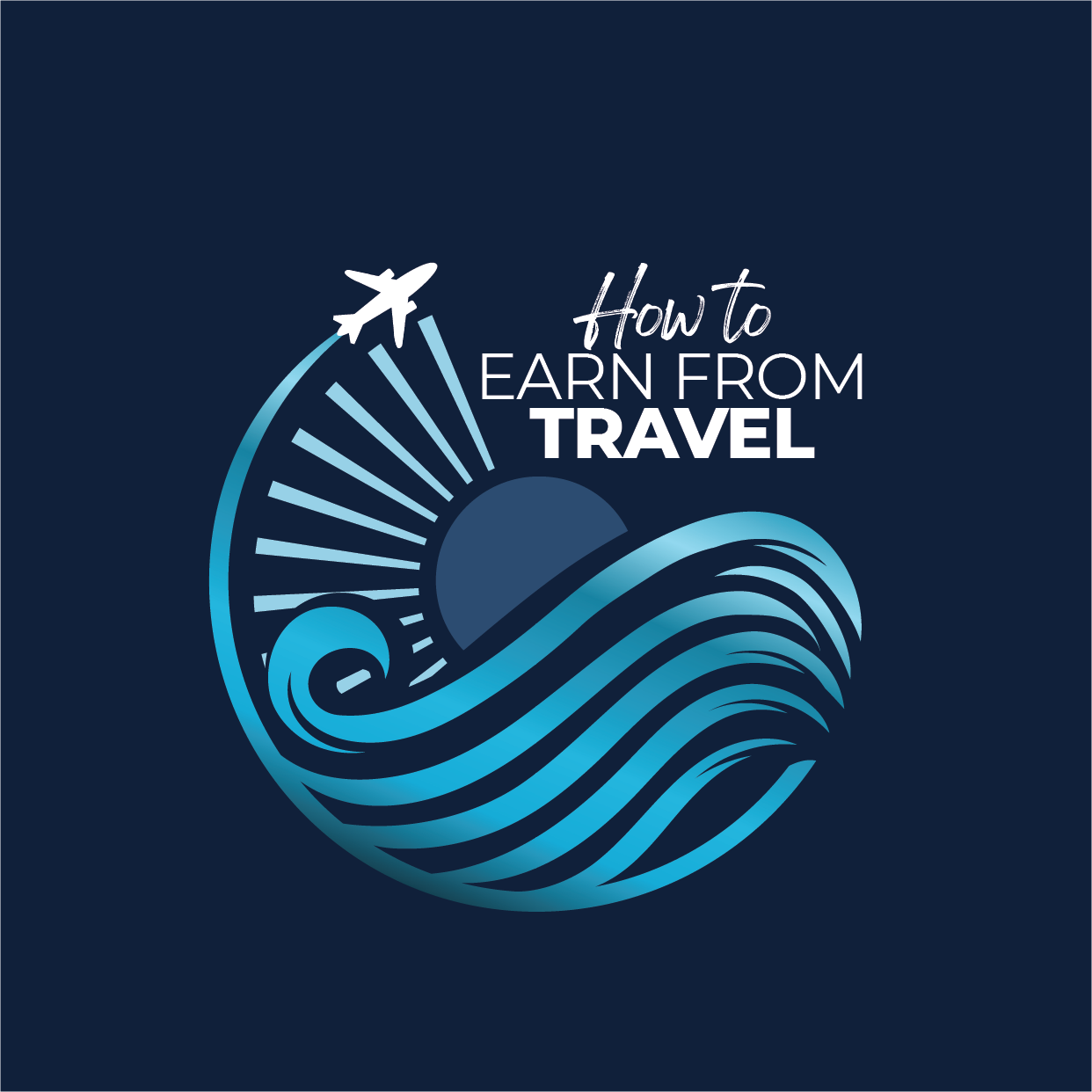
The selected concept evolved around a circular motif that symbolises the cyclical nature of travel and earning. We incorporated radiating lines emanating from the upper left, representing both sunburst rays—evoking destinations and new horizons—and the concept of opportunity spreading outward. These elements naturally formed a path for the aeroplane icon to follow.
The wave pattern became central to our design, representing the fluid movement between locations whilst also suggesting the ebb and flow of travel-based income. The waves create depth and movement, making the logo feel dynamic rather than static.
Colour and Typography
We selected a sophisticated navy background with graduated teal and turquoise tones for the wave elements. This palette evokes both ocean travel and professional trust, whilst the gradient effect adds contemporary appeal. The contrast ensures excellent readability across digital platforms.
The typography combines a handwritten-style script for “How to” with clean, modern sans-serif lettering for “EARN FROM TRAVEL”. This pairing suggests both personal journey and professional opportunity.
Final Execution
The completed logo successfully balances wanderlust with business acumen. The circular composition creates a memorable badge-like quality perfect for social media applications, whilst the sophisticated colour scheme ensures credibility in professional contexts. The design scales effectively across all media, from business cards to website headers.
Word count: 395


