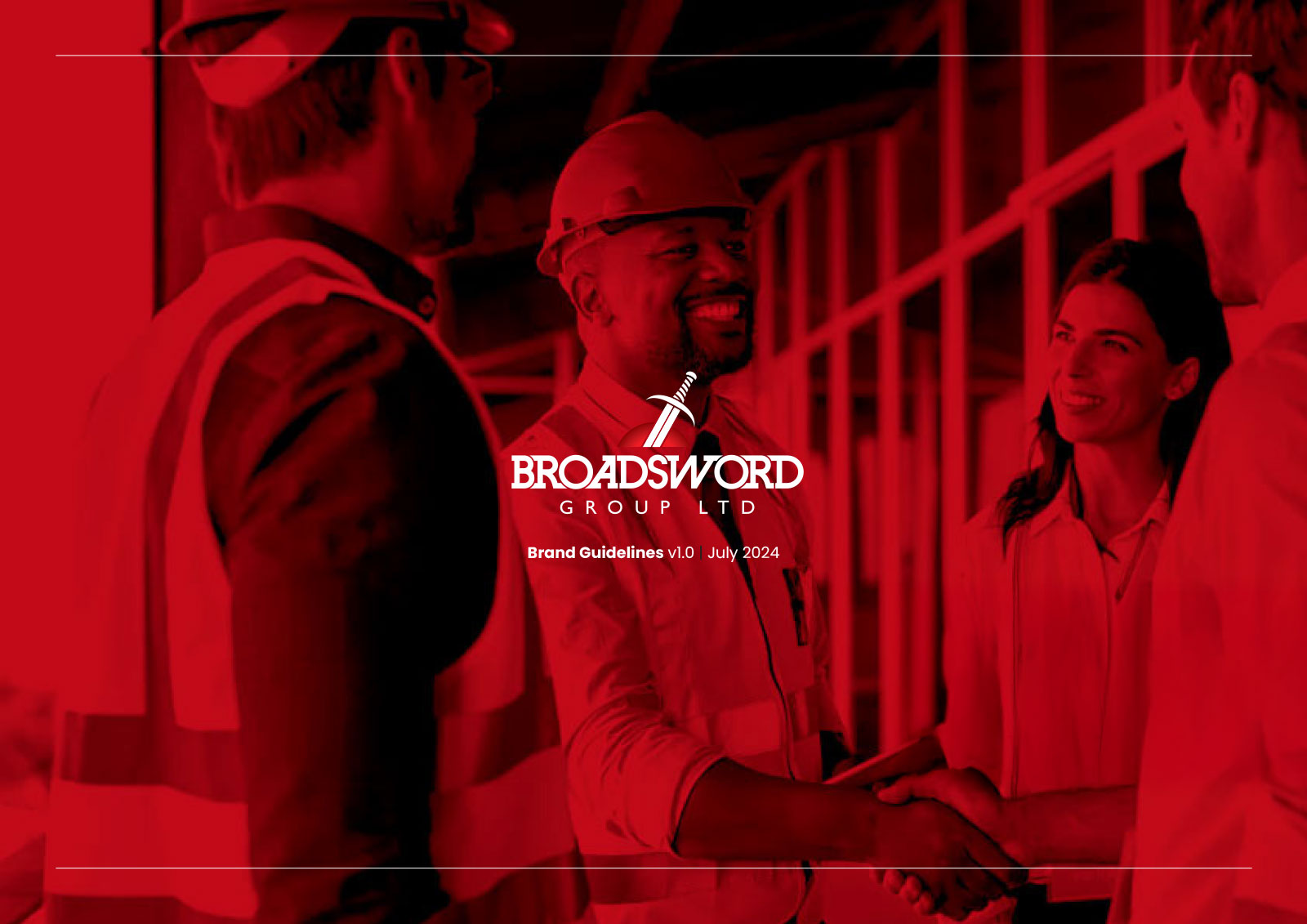
Broadsword Group Brand Guidelines
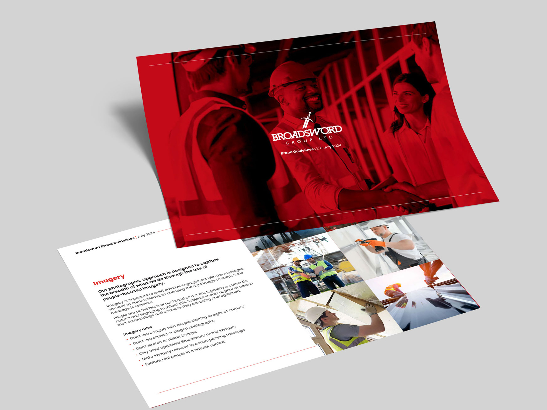
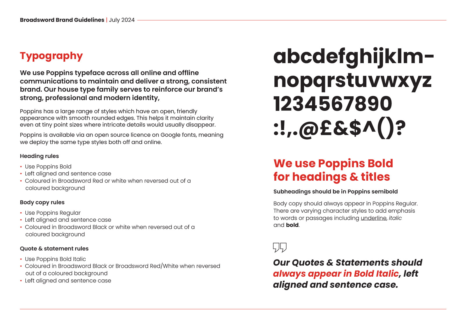
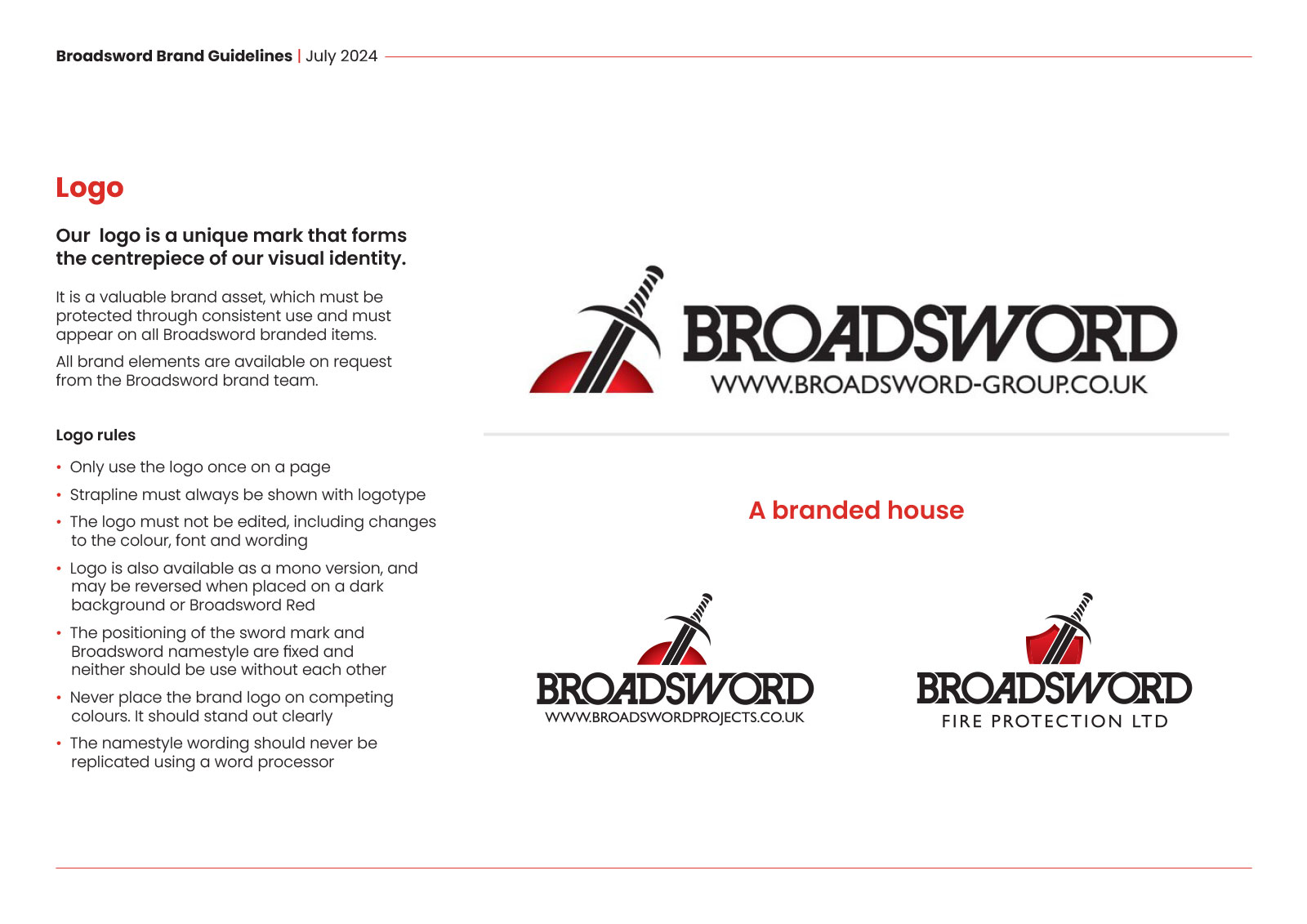
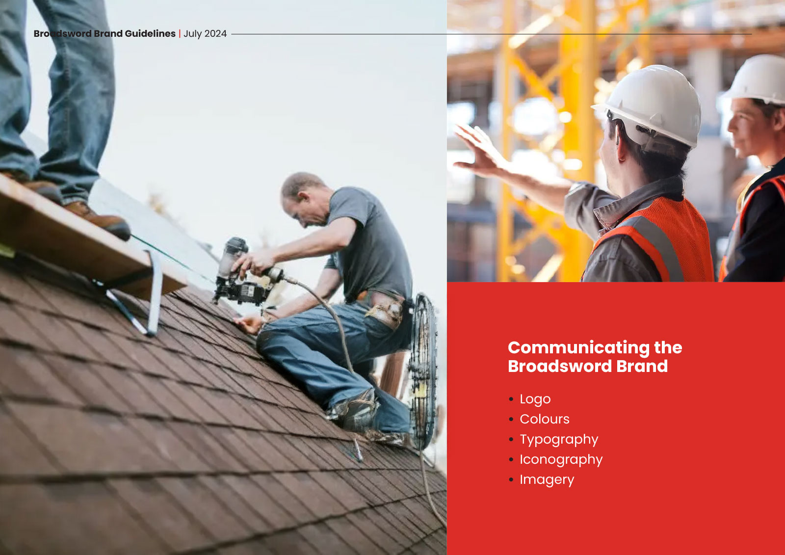
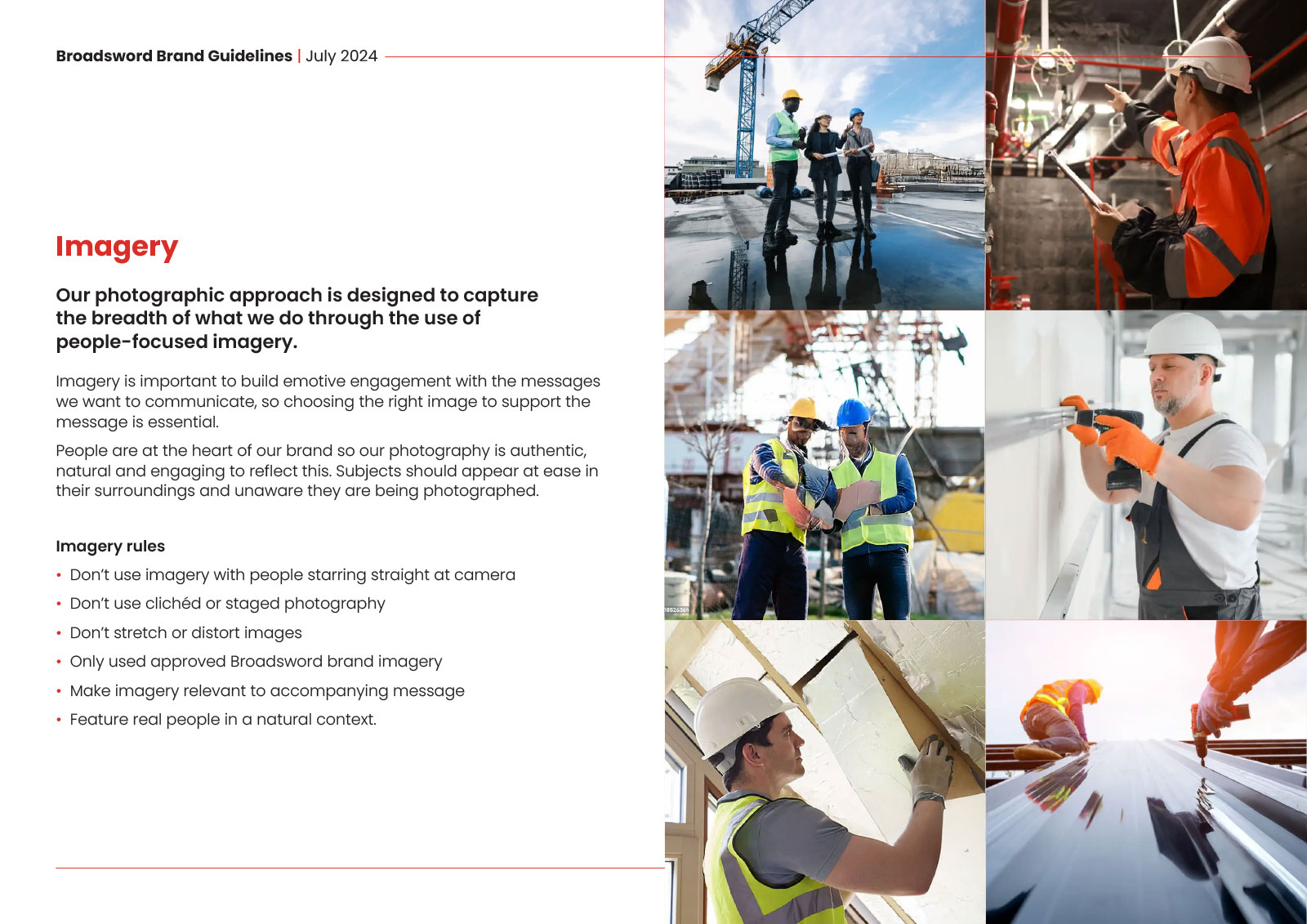
We refined Broadsword’s core brand assets including their logo system, typography, colour palette, and imagery style to create a clear and adaptable framework rooted in the company’s values of strength and integrity. The resulting guidelines were both visually engaging and highly practical, establishing Poppins as the primary typeface, defining an authentic, people-focused imagery style, and setting strict principles around the use of the iconic sword mark.
Task
Broadsword Group, a nationwide leader in construction and fire protection services, approached us to help unify their visual identity across multiple divisions. As the organisation continued to scale, it became clear that stronger consistency was needed to maintain brand clarity and uphold their reputation for precision, reliability, and safety. Our task was to develop comprehensive brand guidelines that could be applied seamlessly across marketing, internal communications, and on-site materials, ensuring every touchpoint reflected a cohesive, professional, and trustworthy image.